Table of Contents:
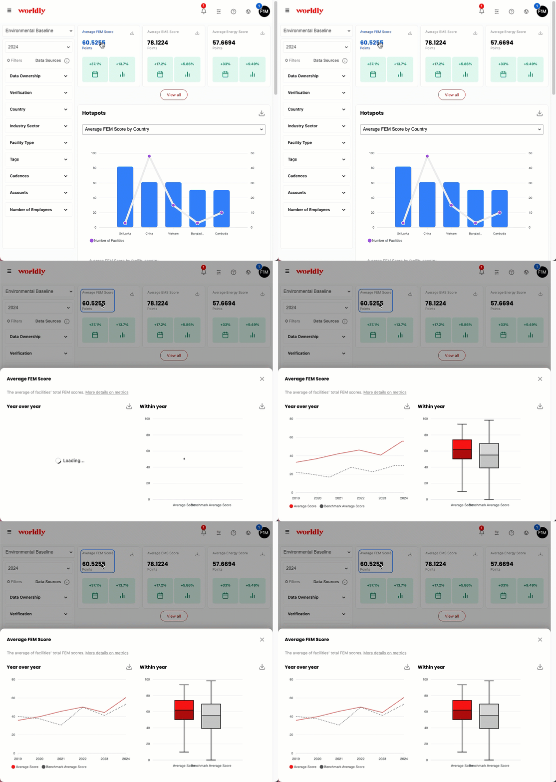
When you click on a KPI card, benchmarking appears in two main places, the year-over-year line graph and the box plot.
Year-over-year line graph
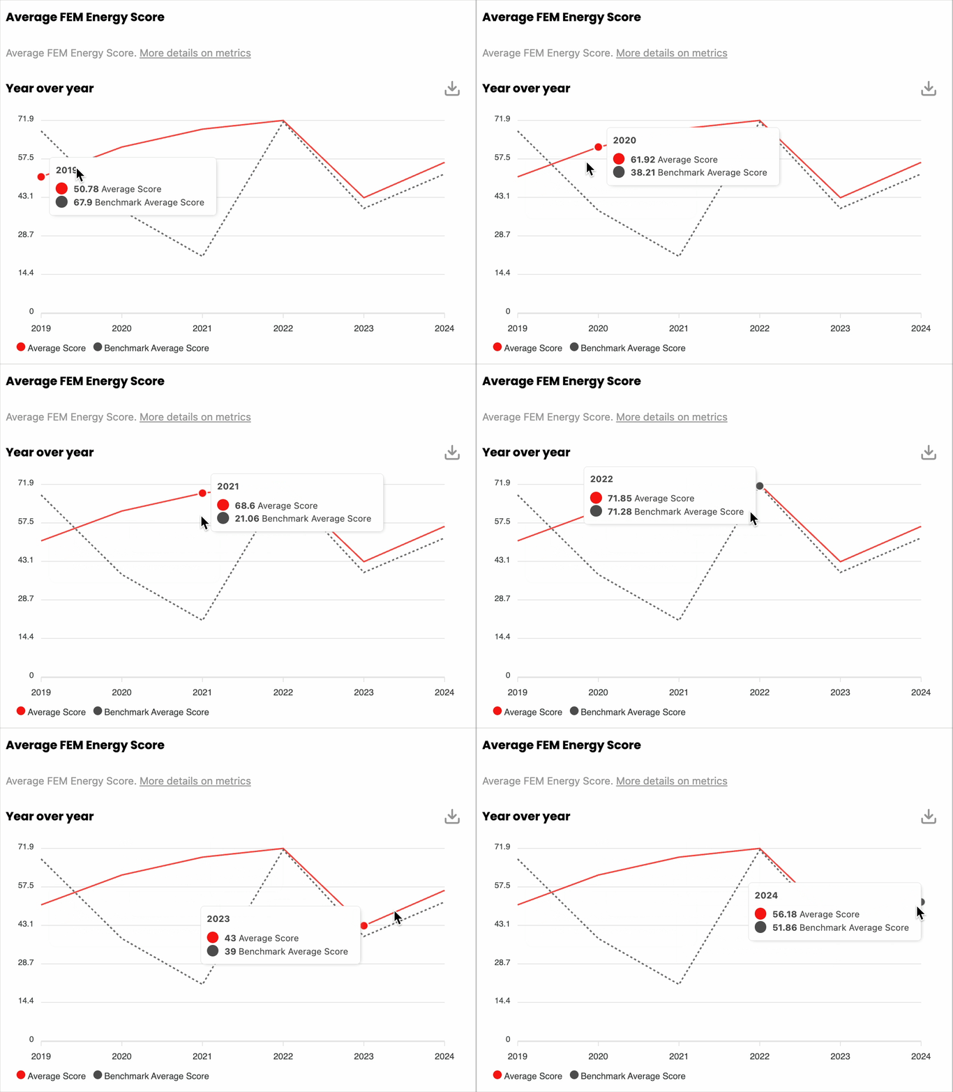
The dotted line in the year-over-year line graph represents the benchmarking dataset.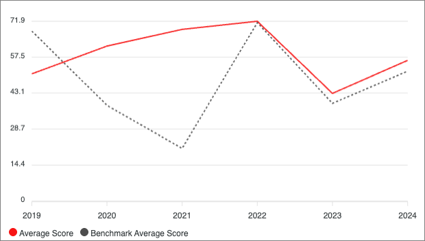
Hovering over the line graph shows further detail on how your performance compares with the industry benchmark.
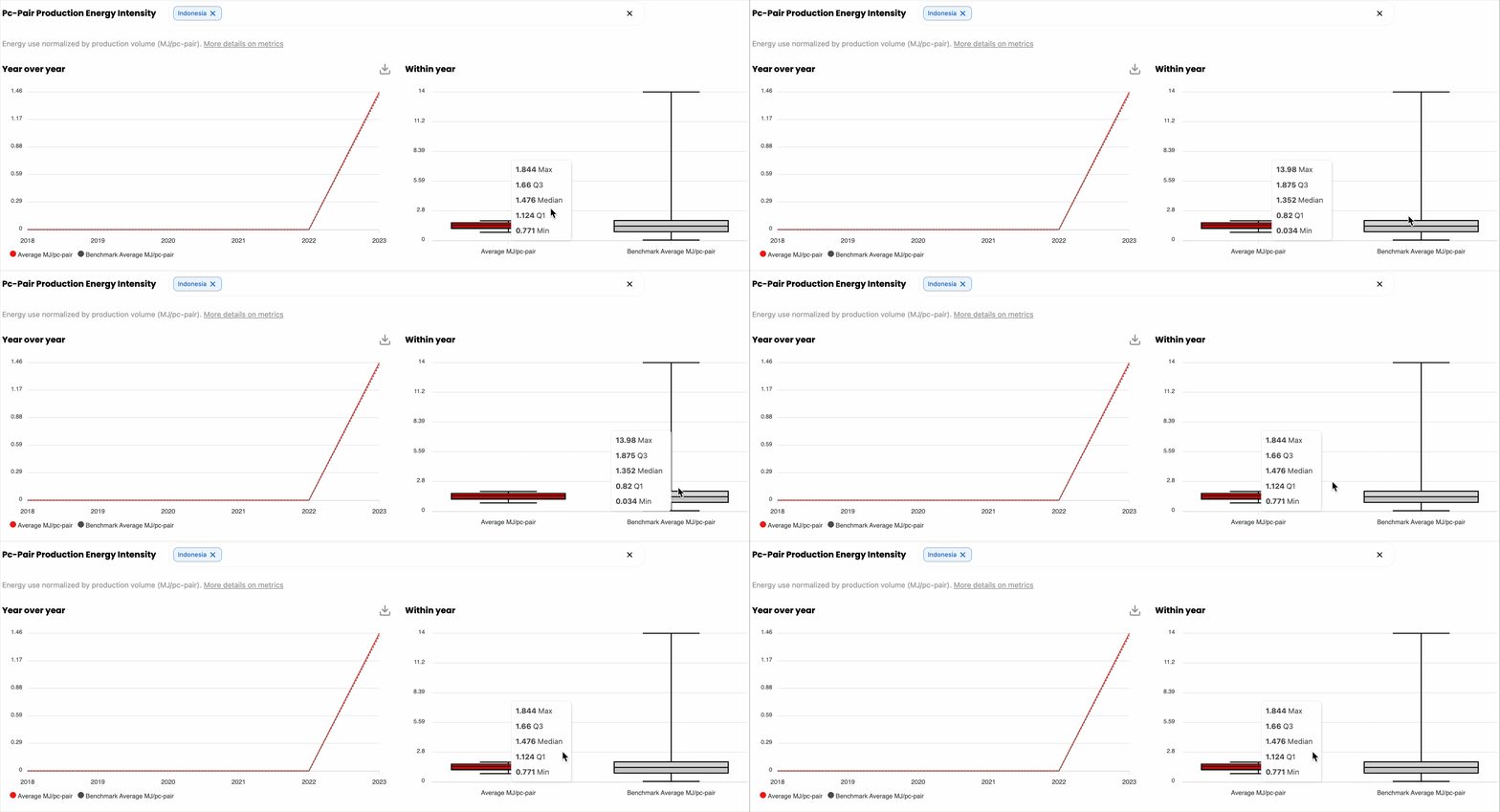
Box Plot
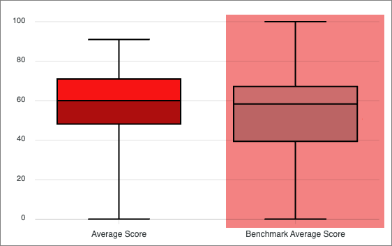
The grey box plot represents the benchmarking dataset.
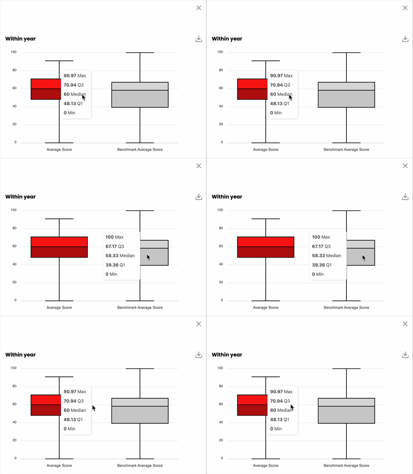
Hovering over each box plot shows further detail on how your performance compares with the industry benchmark.
Benchmarking and Filters
Select filters to customize your data in Insights Hub. The benchmark compares your FEM performance against all FEMs matching your filter selections. Some filters change the benchmark and others change only your data view.
Filters That Change the Benchmark
Apply these filters to customize both your data and your benchmark:
- Verification status
- Country
- Industry Sector
- Facility Type
- Number of Employees
- Facility Processes (any)
- Allocated Production %
- Data Ownership
When you apply these filters, the benchmark updates. Your performance compares against all FEMs that match these filter selections.
Filters That Do Not Change the Benchmark
Apply these filters to customize only your data view. They do not affect the benchmark:
- Facility Tags
- Segments
- Campaigns
- Assessment Tags
- Accounts
- Production volume (kg or pc-pair)
When you apply these filters, your data updates to show only matching items. The benchmark does not change. Your performance still compares against all FEMs that match your benchmarking dataset filters.
Example
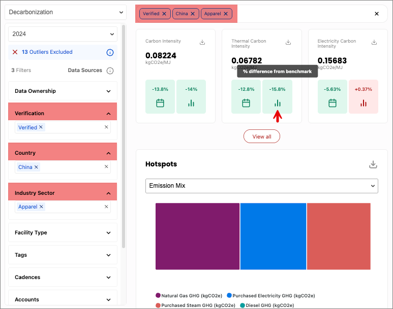
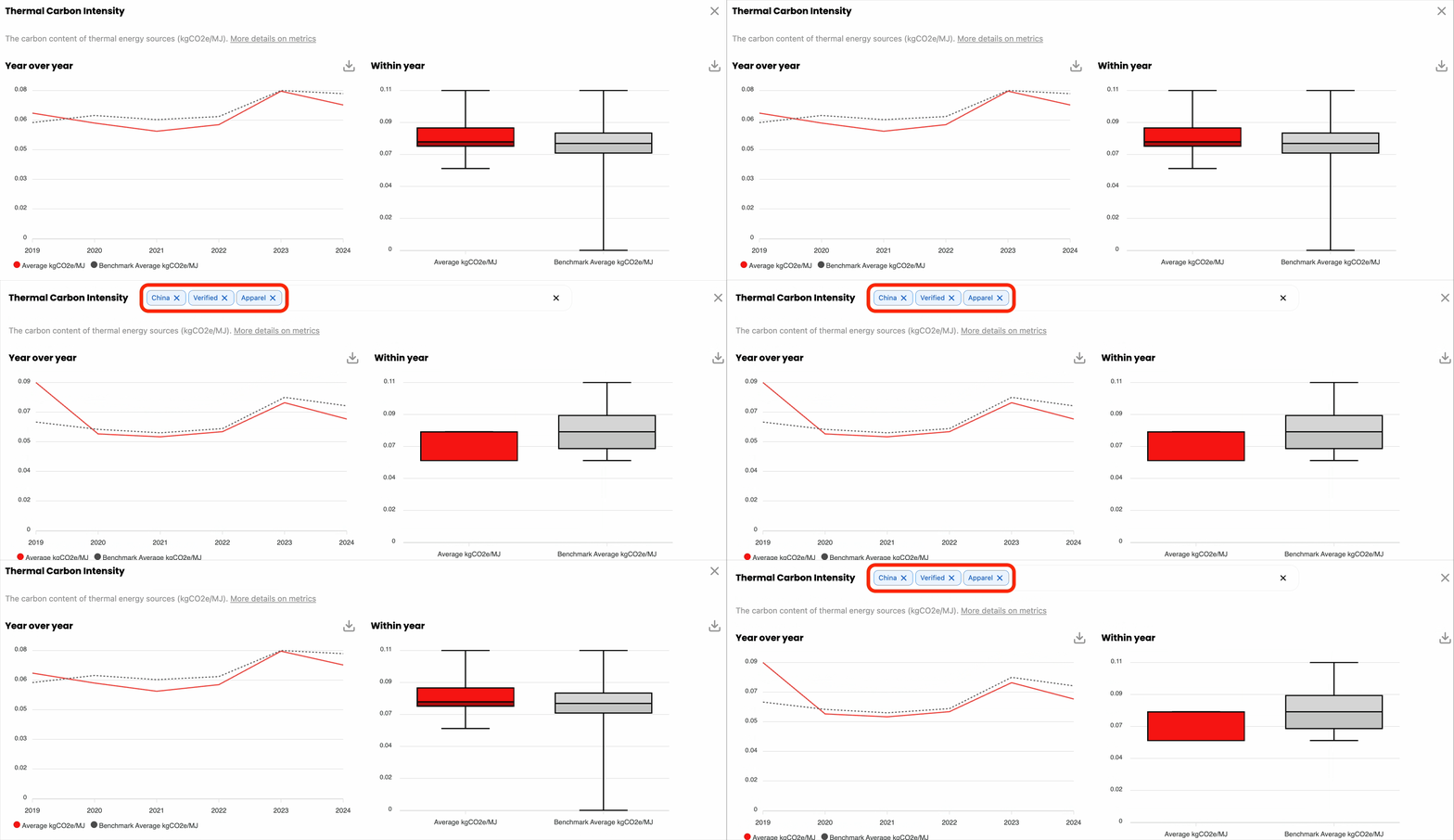
You filter your data to show FEM results from China, in the Apparel industry sector, with verified assessments. The benchmark updates to compare your performance against FEMs from China, in the Apparel industry sector, with verified assessments. The three vertical bars in Insights Hub represent the benchmark and show your percentage difference from it.
Clicking in to the KPI card reveals updated data visualizations according to the applied filters. Notice how the graphs change depending on the filters.
Why is the dashboard blank?
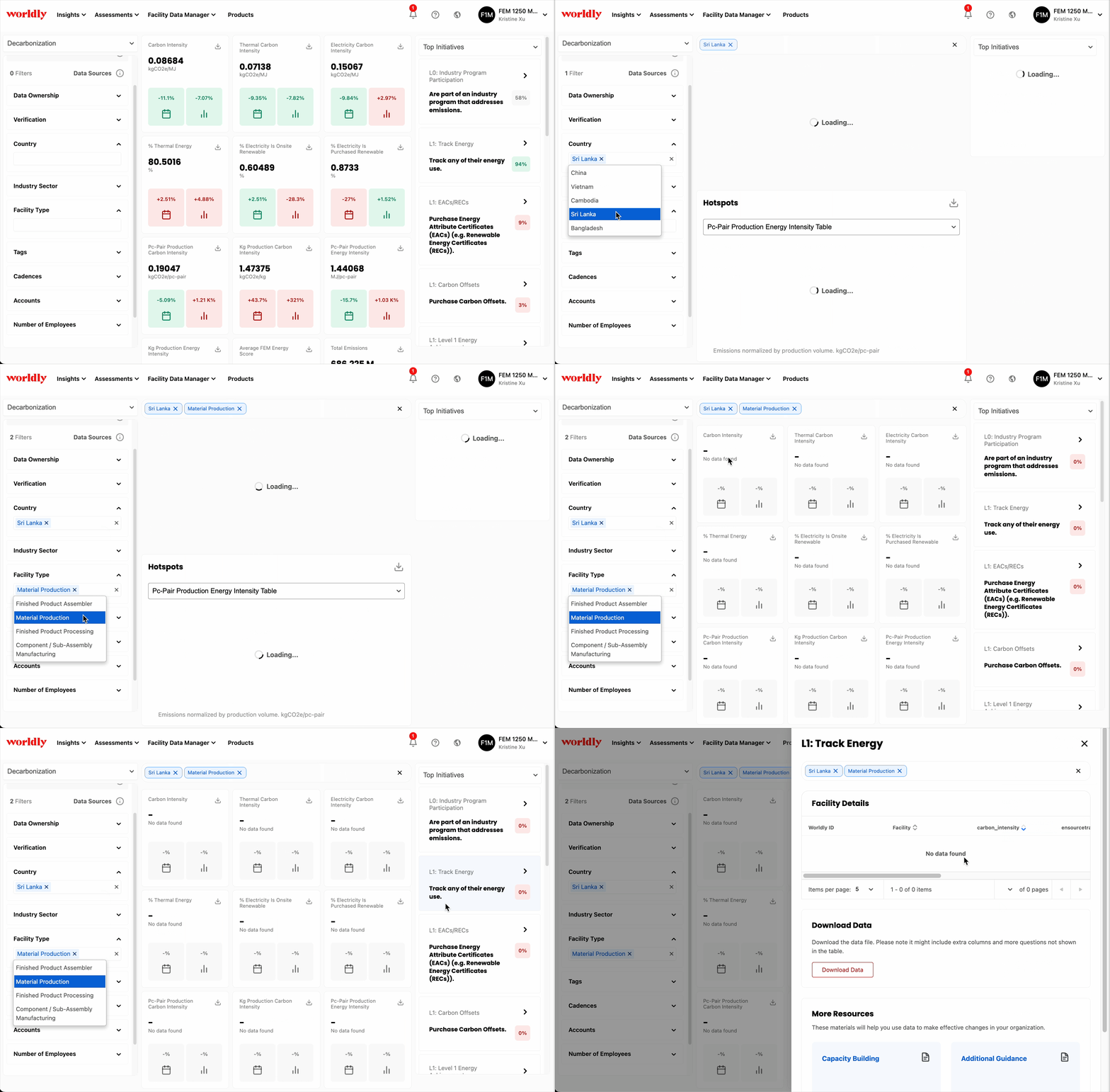
Furthermore, benchmarking data is hidden if the selected filter(s) produce fewer than 25 accounts in the benchmarking data. For example, all data visualizations on the dashboard below are unavailable if the data is filtered to only show Material Production facilities in Sri Lanka.
What's wrong with my box plot?
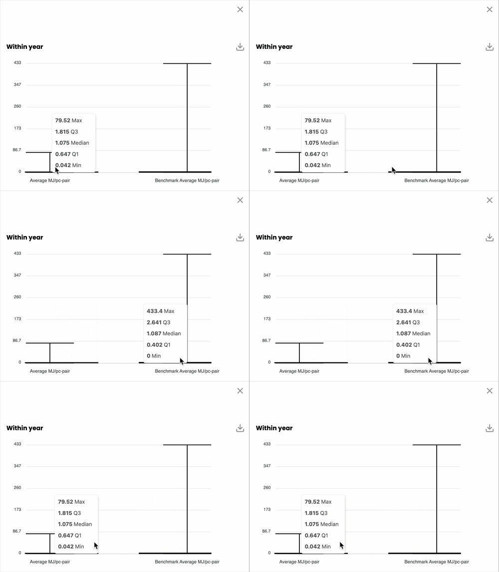
For some KPI cards, the box plot visualization may only show a "T" shape and look differently than the box plot example above. This happens due to a significant difference between your data and the industry benchmark data.
For example, the data visualization below only shows "T" shapes and nothing else. This is due to the right max value (433.4 max) being five times larger than the left max value (79.52 max). In this case, hover over the box plots to see what the datapoints are in closer detail.
You can enhance the visibility of the box plot by filtering the dataset. In the example below, applying the country filter narrows the dataset to produce a more clear data visualization.