
Table of Contents
Navigation
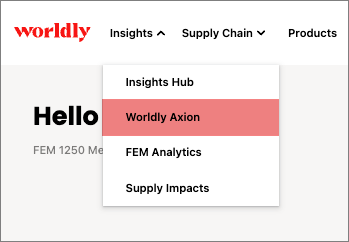
- Navigate to Insights and select Worldly Axion.
- This takes you to the Worldly Axion Overview page.
Select the Hotspots tab.
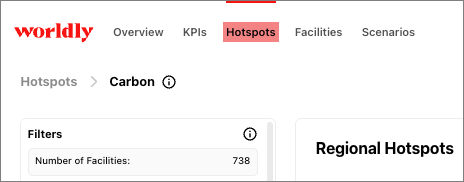
Water Hotspots
Hotspot charts help you pinpoint the impact of your emissions. Browse through the charts to get overall summaries by regions, facilities, and emissions source distribution.
The Water Risk Area has the following hotspots:
Regional Hotspots
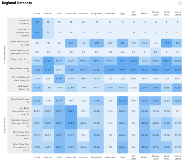
This heat map shows how water use varies by region, combining facility-level assessment data with regional water context over the following metrics:
- Water Intensity per kg (l/kg): The production water intensity by volume (kg)
- Water Intensity per piece/pair (l/pcpr): The production water intensity by number of items (pc/pr)
- Water Use in Prod. %: The % water used in production
- Fresh Water Usage %: The % water that is sourced from freshwater sources
- Recycled / Reused Water %: The percentage of total water used which comes from recycled or reused sources across all facilities
- With Water Targets %: The % facilities with fresh water targets
Source for above: Higg FEM
- High Water Stress %: The percentage of facilities in high water stress regions.
- Near Term Drought Risk (< 1 year) %: The percentage of facilities at risk of drought in the next year
- Projected Drought Risk (up to 2030) %: The percentage of facilities at risk of drought by 2030
- High Water Risk Exposure (< 1 year) %: The percentage of facilities at High water risk exposure in the next year
- High Water Risk Exposure (up to 2030) %: The percentage of facilities at High water risk exposure by 2030
Source for above: SPI6 & WRI Aqueduct
Water Usage
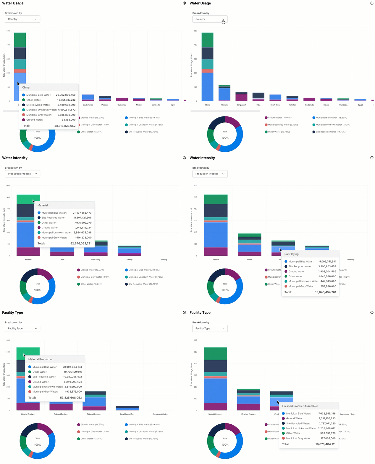
This section shows how water usage is distributed across countries and water sources. The bar chart displays total water use by country, with each bar broken down by type of source such as municipal water, groundwater, recycled water, or other categories. The donut chart summarizes the overall share of each source across the full dataset.
This helps you understand which countries or suppliers are using the most water and what types of water they rely on. High reliance on municipal or groundwater sources may raise concerns about sustainability, while higher shares of recycled water suggest more efficient use and lower impact.
Source: Higg FEM
Disruption Risk
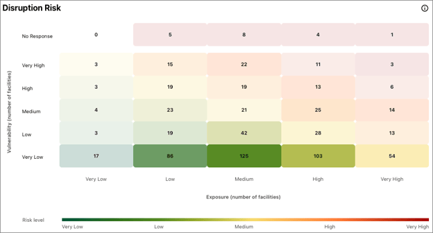
This chart shows a matrix of exposure vs. vulnerability, with cells representing how many facilities fall in each risk level.
Exposure reflects how much a facility is affected by physical water risks, such as drought or high demand. Vulnerability captures how prepared a facility is to cope with those risks. Look for concentrations in the upper right (High–High), and those are at greatest disruption risk.
Source: Higg FEM & WRI Aqueduct
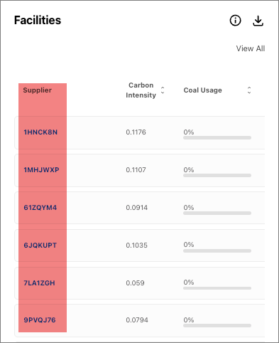
Facilities
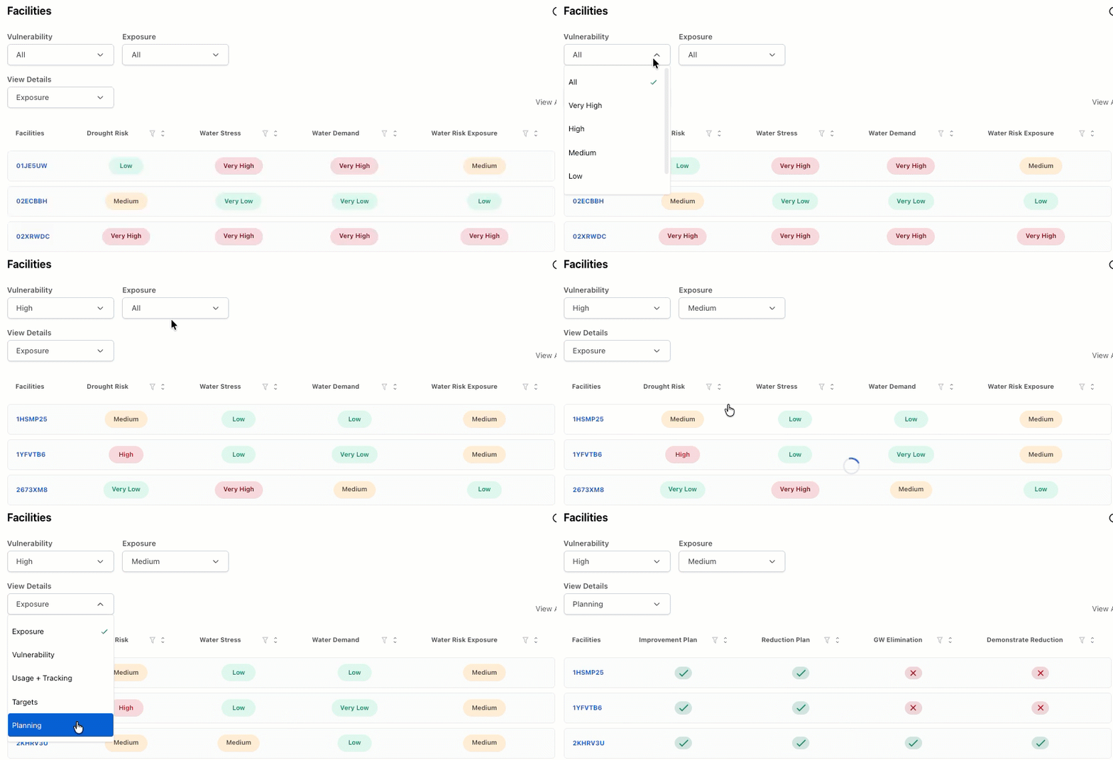
This table shows different water-related indicators for each facility, depending on the selected category.
You can drill down into more detail from an area in the disruption risk table above by selecting corresponding Exposure and Vulnerability Risk Ratings from the drop down menus. Other more detailed views in the second level drop down filter reveal water usage levels, whether reduction targets have been set, and whether facilities have plans in place to manage water risks.
Click on the blue facility name to open the Facility Summary to explore data visually and identify outliers or trends.
Source: Higg FEM & WRI Aqueduct
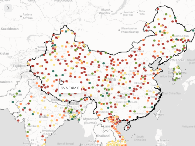
World Map
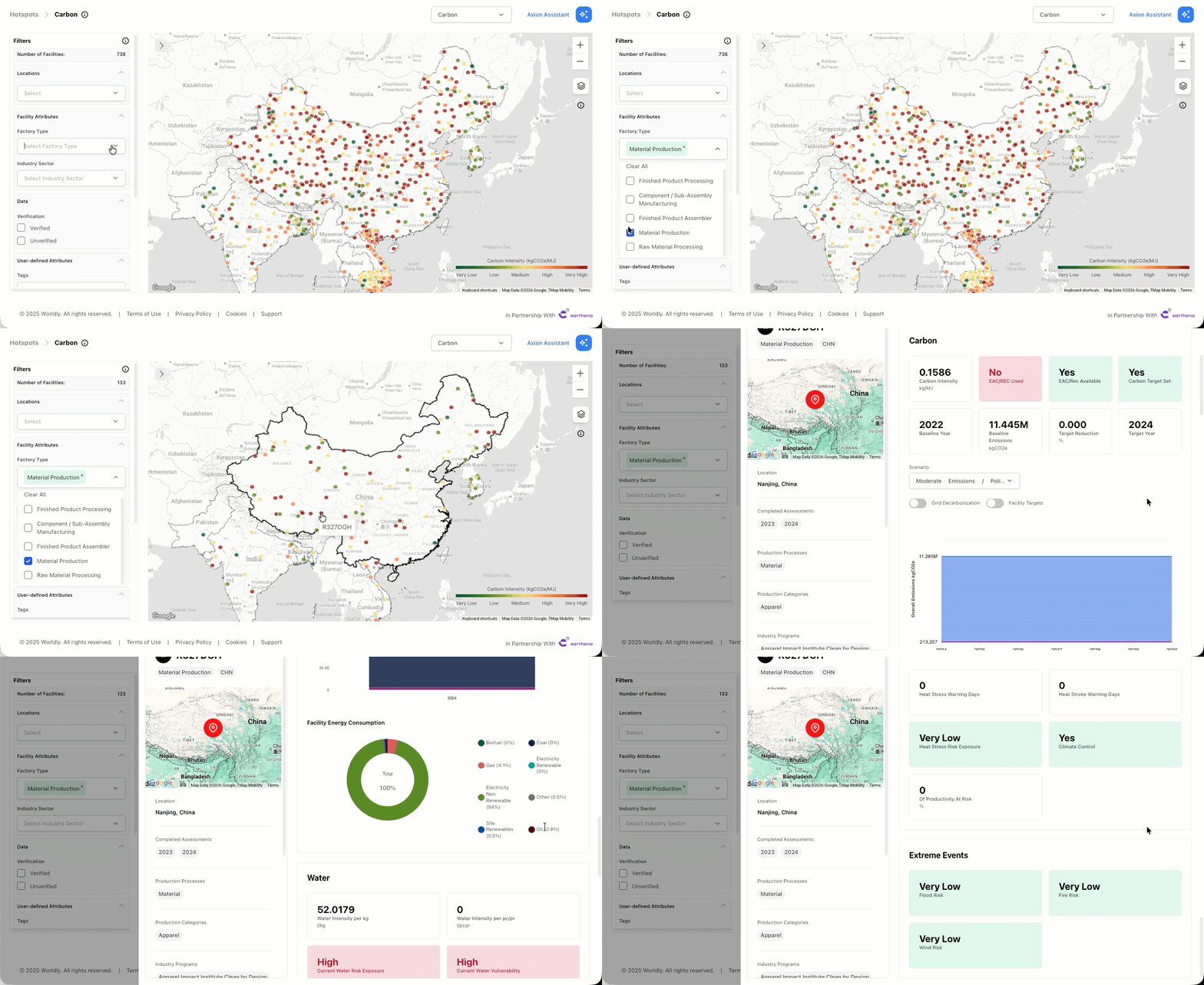
Use the interactive map to analyze regions and facilities with the highest risk and opportunity.
The colored gradient legend shows the carbon intensity of facilities. As carbon intensity increases, the color changes from green (very low carbon intensity) to red (very high carbon intensity).
Click on the color coded facility to switch to the Facility Summary to explore data visually and identify outliers or trends.
Facility Summary
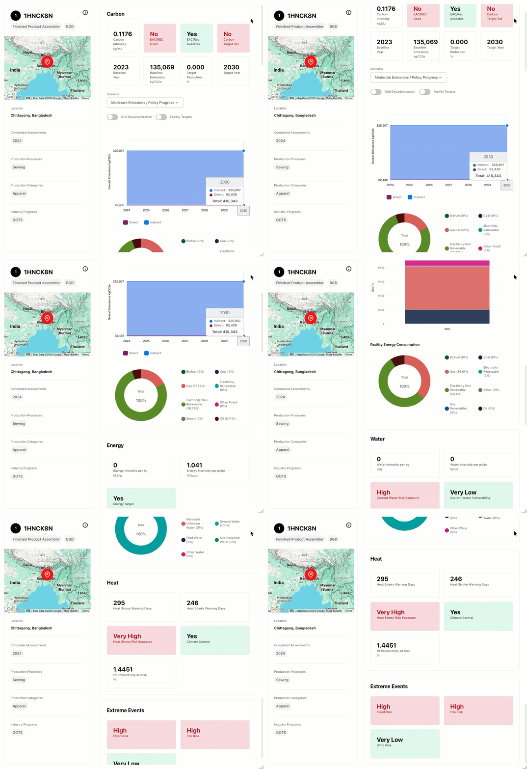
The Facility Summary can be found by:
- Selecting the blue facility name on the Facilities table
- Selecting the color coded facility on the World Map.
Facility Section
This section provides a snapshot summary of all available metrics for the specific facility selected. Facility data is provided for the most recent assessment submitted. Heat and Extreme Event risk ratings are calculated using the Climate scenario SSP2-4.5 and for near term (2025-2030) timescales. Full details can be found in the Methodology.
Facility Summary
This section displays specific headline metrics in a radar chart, contrasting the selected supplier data with all other suppliers.
Carbon
This section displays emissions data and existing targets, which can be further interrogated in Direct and Indirect groupings by the emissions graph below. Available scenarios are:
- Low Emissions / Net Zero 2050 Aligned (NGFS Net Zero 2050)
- Moderate Emissions / Policy Progress (NGFS Nationally Determined Contributions)
- High Emissions / Limited Progress (NGFS Current Policies)
The doughnut chart displays a breakdown of the carbon emissions fuel sources by %.
Energy
This section displays energy intensity data and existing targets. The country and facility grid mix fuel sources are displayed by % in the bar chart and doughnut graph below.
Water
This section displays water intensity metrics, current water risk exposure and vulnerability ratings, existing water reduction targets and water sources by % in the doughnut chart below.
Heat
This section summarizes the number of Heat Discomfort and Stress warning days, whether climate control is in operation at the facility and the % of productivity at risk.
Extreme Events
This section provides the facility direct risk rating for each of the main physical risk hazards considered on this platform; flood, wildfire and extreme wind.
Filters
The left-hand filter column automatically updates all metrics throughout the dashboard to reflect the filtered data set. Filters that are applied once are applied to all tabs within Worldly Axion. The dashboard filters enable users to organize and slice the data to quickly determine which facilities are best suited for intervention.
Adjust these filters to model different future states by country, facility type, production process and year. This enables more specific scenarios by facility, region or other combination of facilities based on filters. Further detail on how these metrics are defined can be found in the Methodology.
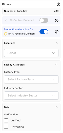
100% of production is allocated to your account if not defined or if turned off. Currently only share recipients can define their own FEM allocations, not facilities themselves. It may take an hour for new allocations to show up here in Insights Hub.
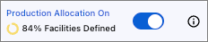
The color-coded widget corresponds with the percentage of facilities with production volume allocation defined.
- Red = 0 - 50%
- Yellow = 51 - 99%
- Green = 100%
- Factory Type - Select the applicable facility types.
- Industry Sector - Select the applicable industry sectors.
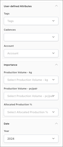
In addition to the production volume "bands" (1k-150k, etc.), there are options for 0 and 1-1k.
Select these options to easily view and/or exclude outliers with very low or very high production volume in kilograms.
Additionally, Allocated Production %, Production Volume (kg), and Production Volume (Pc-Pr) are inherently connected to the facility type. When they are selected, whole facilities will not be shown in the dashboard, but rather only those facility-facility type pairs that meet the criteria.
In addition to the production volume "bands" (1k-150k, etc.), there are options for 0 and 1-1k.
Select these options to easily view and/or exclude outliers with very low or very high production volume in pieces or pairs.
Additionally, Allocated Production %, Production Volume (kg), and Production Volume (Pc-Pr) are inherently connected to the facility type. When they are selected, whole facilities will not be shown in the dashboard, but rather only those facility-facility type pairs that meet the criteria.