
Table of Contents
- 1. Navigation
- 2. Impact Areas and Dashboard Overview
- 3. Filters
- 4. KPI Cards
- 5. Hotspots
- 6. Initiatives
- 7. Putting it all together
- 8. How to add tags after creating a cadence
The Insights Hub is the dashboard for monitoring key metrics, identifying risks, and driving measurable progress across your supply chain. Built specifically for the consumer goods industry, it transforms sustainability data into powerful and actionable insights that moves the needle from compliance to strategic advantage.
Whether you're a brand, retailer, manufacturer, vendor, or facility, the Insights Hub provides visibility and transparency that makes your sustainability data more actionable, comparative, and accessible. Easily track initiatives like coal phase-out or water reduction, compare performance to peers, and access embedded educational resources to guide action with this dashboard.
The Insights Hub helps you:
- Simplify complex sustainability data by translating high-level industry metrics into business-relevant insights, which strengthens cross-organizational collaboration.
- Track progress with industry-aligned metrics and peer benchmarking to demonstrate improvements, identify areas that require attention, and make data-driven decisions.
- Prioritize actions with pinpoint accuracy by transforming facility data into compelling data visualizations that highlight hotspots.
- Build a more resilient, future-proof supply chain by tracking facility initiatives, monitoring implementation progress, and leveraging built-in educational resources.
All Insights Hub data is fully filterable. Data visualizations are organized into Key Performance Indicators (KPIs), hotspots, and initiatives, which enables companies to quickly and easily report on progress and identify where to take action next.
By highlighting exactly where to act and how, the Insights Hub empowers you to engage teams across your organization and take meaningful, measurable steps toward sustainability goals.
1. Navigation
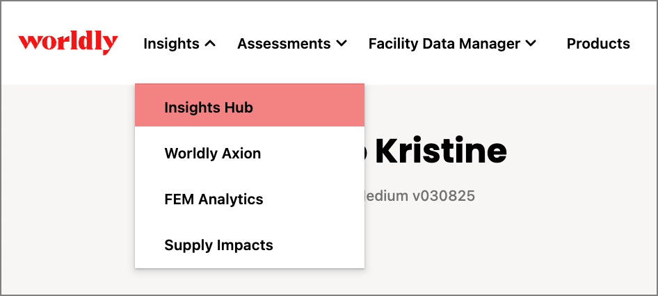
- Access Insights hub under Insights in the navigation bar.
- This takes you to the main dashboard view.
2. Impact Areas and Dashboard Overview
The Insights Hub Dashboard has several data visualizations to support your sustainability journey.
Using Facility Environmental Module (FEM) data, these data visualizations are organized around specific impact areas such as Environmental Baseline, Decarbonization, Waste Reduction and Circularity, Water Use Reduction, and Social Baseline.
The dashboard is structured with decision-making in mind and focuses on actionability. KPI cards are located at the top of the page, hotspot charts are below, and actionable initiatives are on the right-hand column.
These visualizations highlight current data alongside the contextual information needed for decision-making.
Production Volume Allocation
The first time you access the dashboard, a banner at the top of the page will prompt you to define your production allocation.

- Select Learn more to read the FEM: Production Volume Allocation guide for Brands.
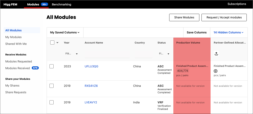
- Select Define Production Allocation to allocate production volume in the FEM All Modules table. When production is allocated, you may need to wait up to an hour in order to see those changes reflected in the dashboard.
- Closing the banner will remove it from your dashboard.
Production Volume Allocation is applicable to the following dashboards. Click on each article to learn more:
- Insights Hub: Environmental Baseline Dashboard
- Insights Hub: Decarbonization Dashboard
- Insights Hub: Waste Reduction and Circularity Dashboard
- Insights Hub: Water Use Reduction Dashboard
Facility Profile View within Insights Hub
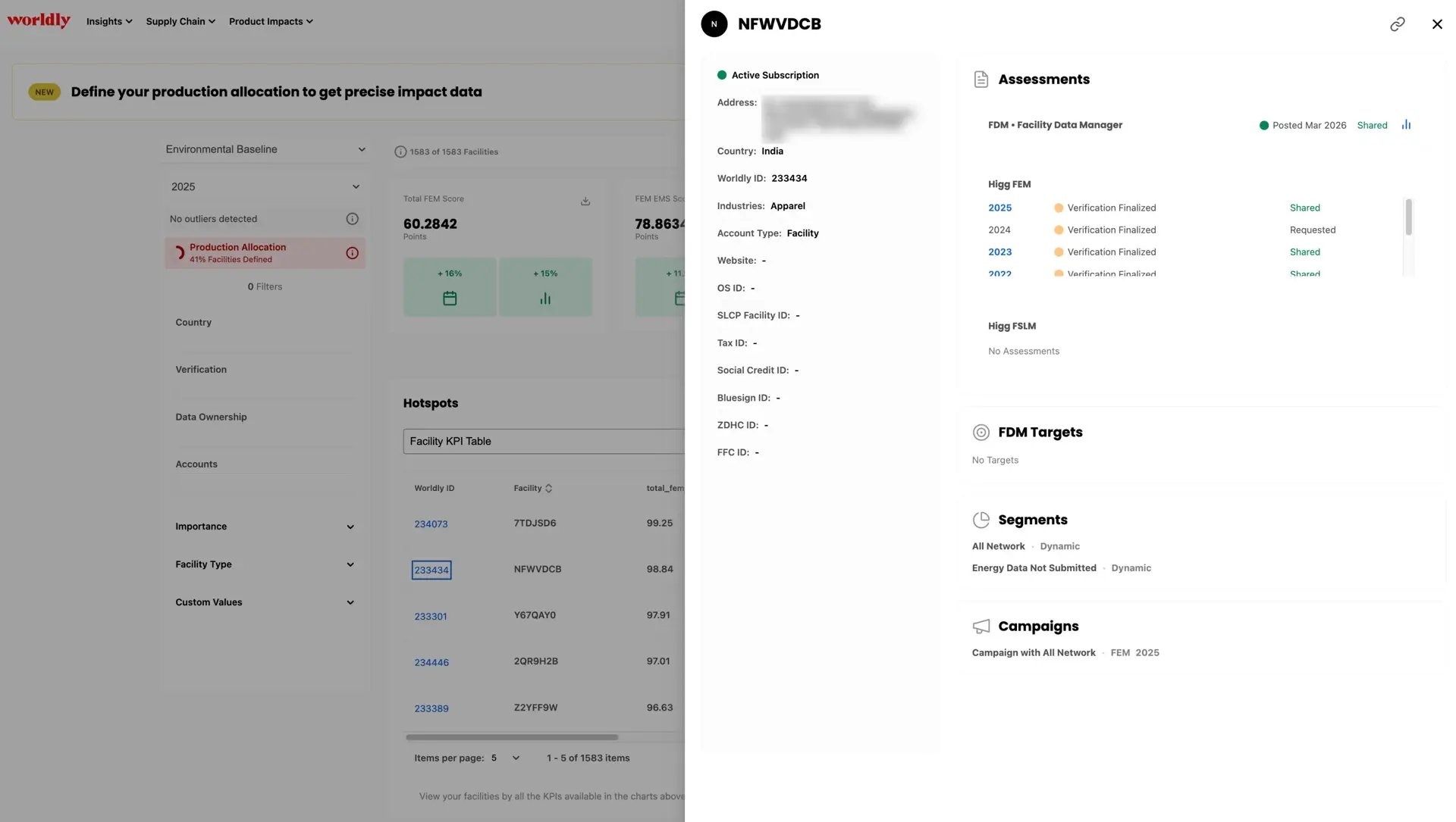
You can open the Facility Profile directly from Insights Hub. Click on a Facility ID in any table and the Facility profile appears, offering insight into their assessment history and general details. Click on the blue links to view the individual assessments.
Data Usage
These visualizations use data from 2023 and 2024. While historical data from 2017-2022 will be available in the year-over-year charts, the dashboard will not show KPIs for those years since the dashboard centers around actionability with current data. Dashboards that focus on insights from 2022 and earlier may be included in future updates.
Brand vs. Facility views
The dashboard and filters will look similar for both Brand and Facility users, however, Facility users will only be able to see data for their facility. In addition, Facility users will only see 0% or 100% in the initiatives section since they can only see their own data. Some hotspot charts may also be less relevant if you’re a Facility user.
Dashboard Refresh Frequency
The data used in these visualizations are refreshed every hour. For example, if you add tags or add assessments to cadences, you may need to wait up to an hour in order to see those changes reflected in the dashboard. This also applies to newly posted assessments.
3. Filters
The left-hand filter column automatically updates all metrics throughout the dashboard to reflect the filtered data set. The dashboard filters enable users to organize and slice the data to quickly determine which facilities are best suited for intervention.
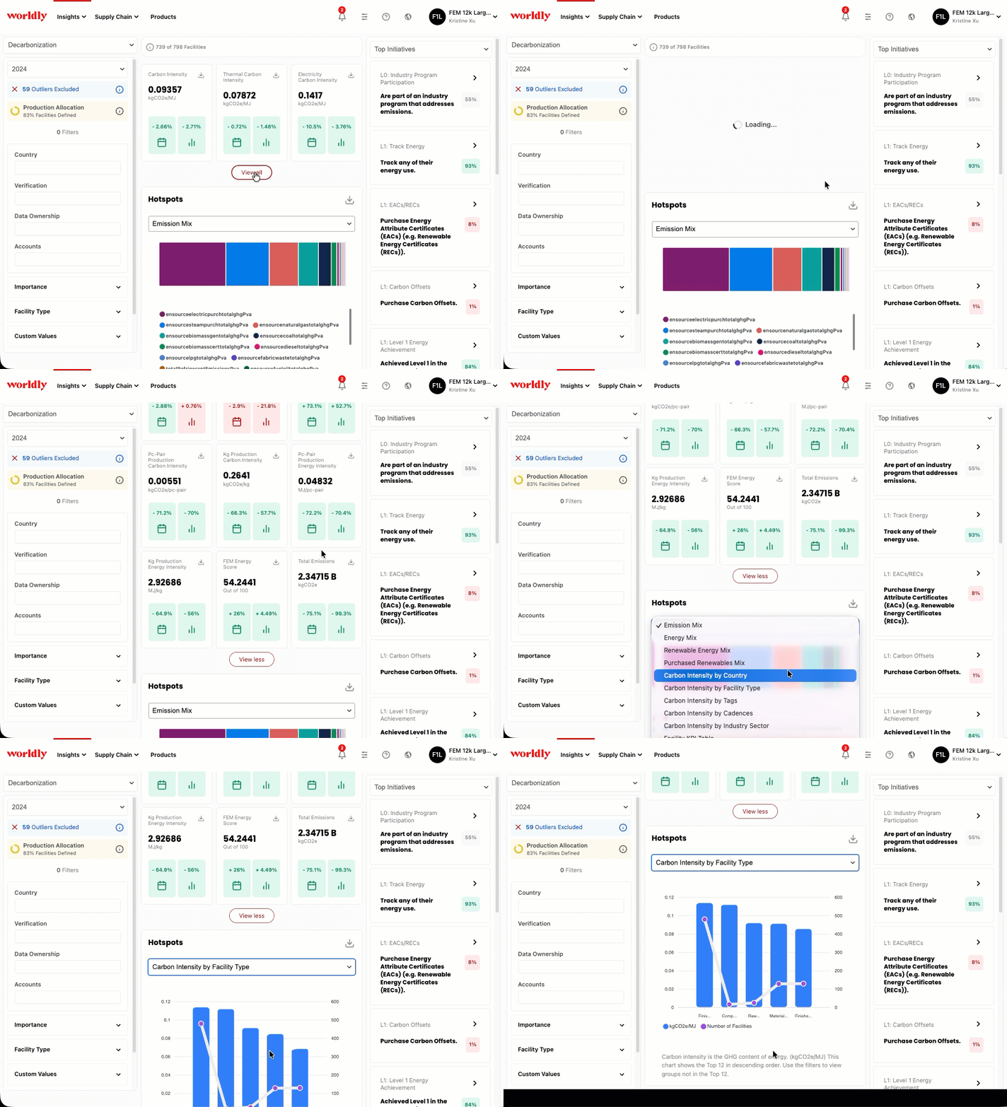
Some of the most common filters used include country, facility type, tier type, or tags. You can also apply multiple filters at the same time, such as country, facility type, and other parameters.
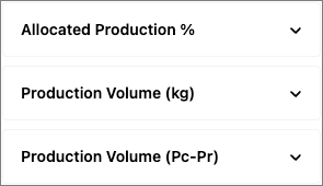
There are also three filters specific to Production Volume Allocation, including Allocated Production %, Production Volume (kg), and Production Volume (Pc-Pr).
When any of these filters are applied, relevant KPI Cards update to show values specific to that filter.
Production Volume (Pc-Pr) Example
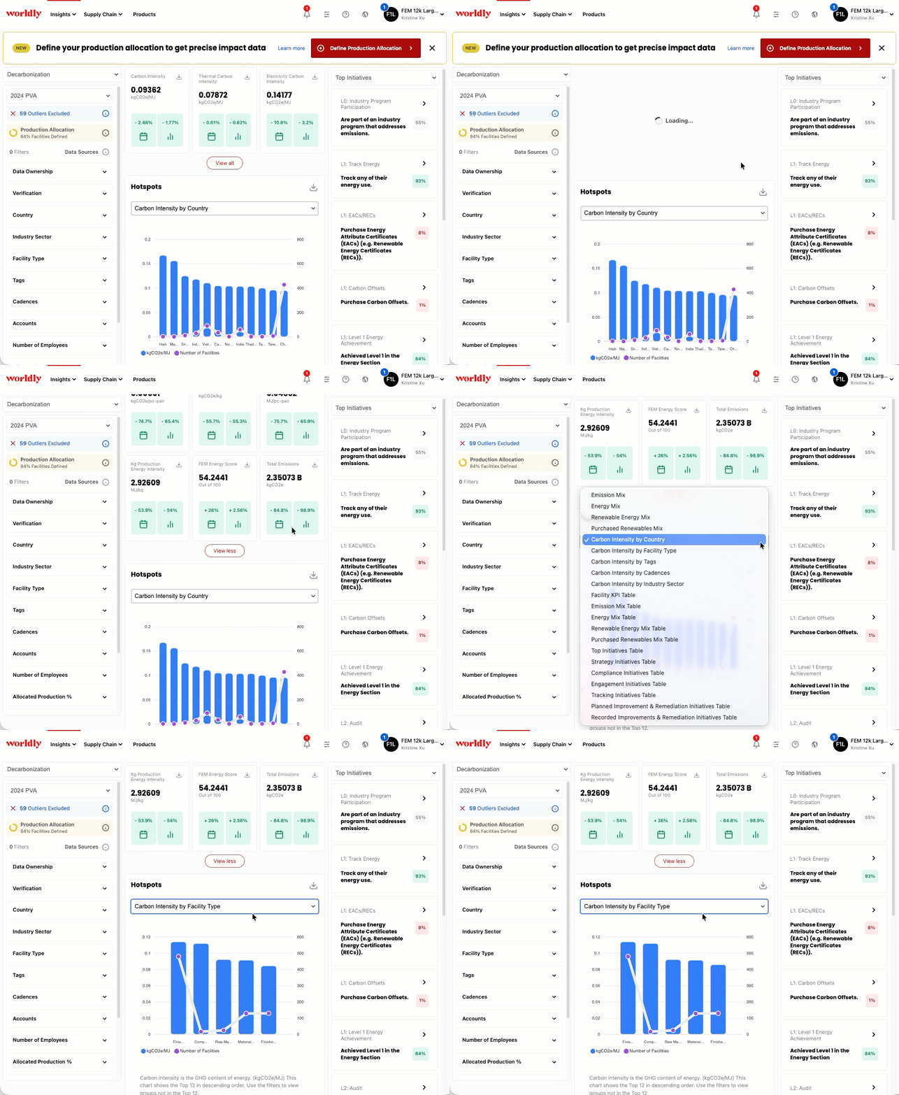
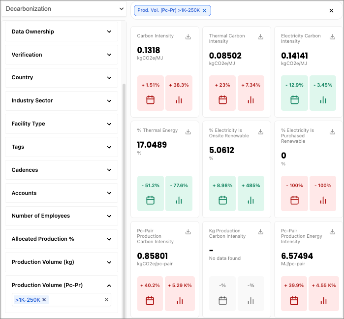
For example, if we filter for >1k-250k for Production Volume (Pc-Pr), the KPI Cards update to just show KPI values for facilities where there is >1k-250k pieces or pairs of production volume allocation.
Before filtering: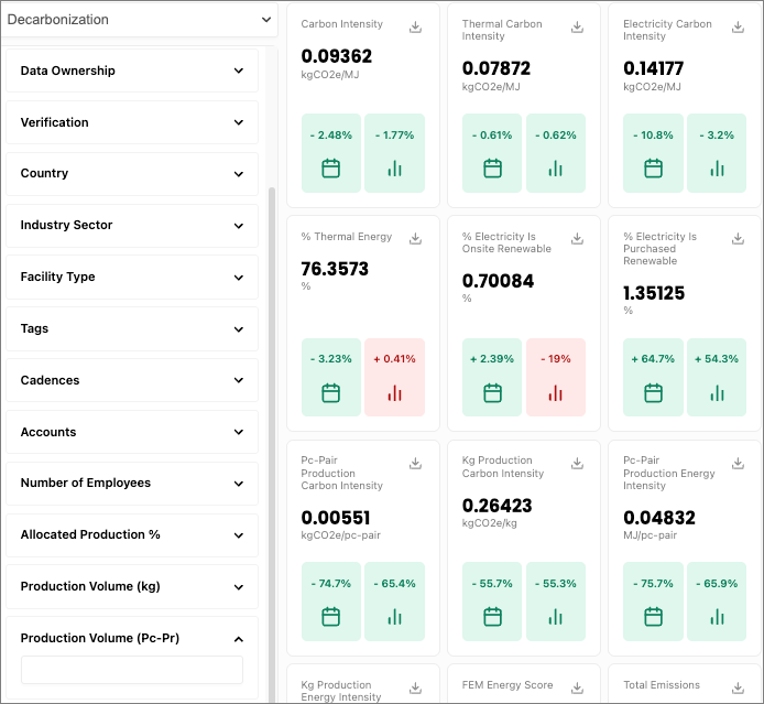
After:
Learn more about how filters work in Insights Hub below:
- Dashboards with Production Volume Allocation Filters
- Dashboards without Production Volume Allocation Filters
Facility Type Filtering
When the Facility Type filter is applied, the dashboard updates to only show data from the facility type. Additionally, when this filter is applied, data prior to 2023 will not be shown since that is when this logic was introduced.
- For example, if we apply the filter Finished Product Assembler, the dashboard updates to only show data from facilities that have the facility type of Finished Product Assembler.
Facility KPI Table Example
In the screenshot below, the hotspot chart Facility KPI Table updates to reflect only data from Finished Product Assembler facility types.
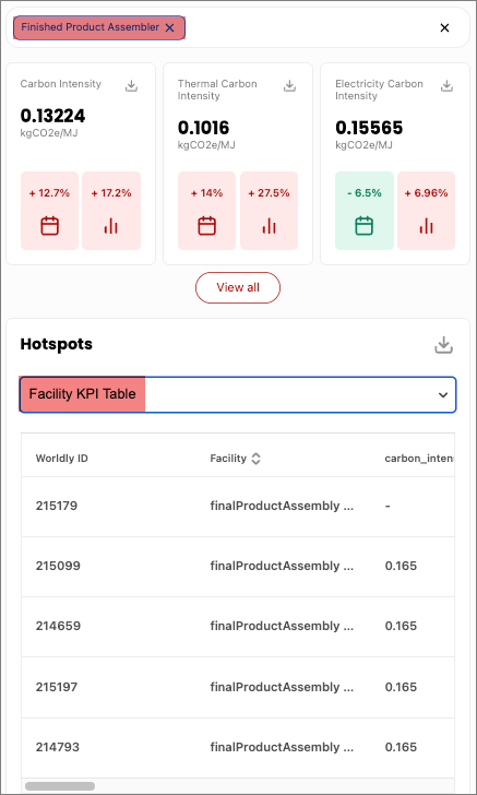
Furthermore, comparisons are only made between common facility types, allowing for more accurate benchmarking. So for example:
- If the Finished Product Assembler filter is applied and a facility has multiple facility types including:
- Finished Product Assembler
- Component / Sub-Assembly Manufacturing
- Then the data shown on the dashboard:
- Would only include data from Finished Product Assembler ✅
- Not from Component / Sub-Assembly Manufacturing ❌
Note: If more than one facility type is selected in the filters, the dashboard data reflects the totality of values from both facility types combined together. It does not reflect data strictly from facilities with multiple facility types.
4. KPI Cards
At the top of the dashboard, there are three KPI cards that each highlight a different critical metric for tracking progress.
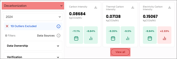
Different KPI cards will appear based on which Impact Area you have selected. Click View All to reveal all KPI Cards.
- Environmental Baseline KPI Cards
- Decarbonization KPI Cards
- Waste Reduction and Circularity KPI Cards
- Water Use Reduction KPI Cards
- Social Baseline KPI Cards
Clicking on the KPI Card reveals a drawer where you can see year-over-year changes and a box plot. Additionally, the definition provided at the top also indicates whether this KPI is affected by Production Volume Allocation.
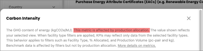
Conversely, it will state if the metric is not affected by production allocation.
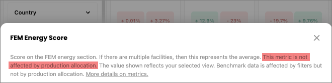
Both graphs are also downloadable by clicking on the icon in the upper right-hand corner.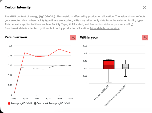
Benchmark data is affected by filters but not by production allocation. Click here to learn more about benchmarking.
5. Hotspots
The hotspot charts help you pinpoint the impact of your emissions. Browse through the charts to get overall summaries by regions, facilities, and emissions source distribution.
Each hotspot chart is downloadable by selecting the icon in the upper right corner. Downloading bar charts produces an image, while downloading tables produce a CSV file.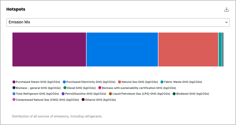
Depending on the Impact Area selected, different hotspots will appear:
- Environmental Baseline Hotspots
- Decarbonization Hotspots
- Waste Reduction and Circularity Hotspots
- Water Use Reduction Hotspots
- Social Baseline Hotspots
6. Initiatives
The right-hand column features a list of initiatives that facilities can take action on. The data used in each initiative comes directly from specific questions in any section of the FEM.
Note: Only Engagement or Impact subscriptions can access this feature. Production Volume Allocation does not affect Initiative percentages.

Depending on the Impact Area selected, different initiatives will appear:
- Environmental Baseline Initiatives
- Decarbonization Initiatives
- Waste Reduction and Circularity Initiatives
- Water Use Reduction Initiatives
- Social Baseline Initiatives
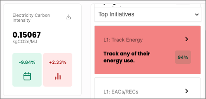
For example, you can see at a glance what percentage of your facilities track any of their energy use. In this screenshot 94% of facilities have a coal phaseout plan.
7. Putting it all together
Next, we’ll walk through an example that illustrates the Insights Hub in action.
Let’s say a company wants to understand how to focus their sustainability resources more effectively by comparing emissions between facilities in China and Bangladesh.
By selecting China and Bangladesh under the Country filter, as well as Final Product Assembly and Packaging Production under the Facility Type filter, the entire dashboard refreshes and provides valuable business insights from the selected year’s assessment. 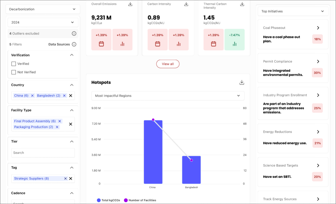
KPI Cards
For example, the company can see how final product assembly and packaging production facilities in China and Bangladesh have increased overall emissions, carbon intensity, and thermal carbon intensity based on the year-over-year increase in the KPI Cards.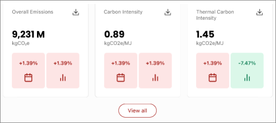
Hotspots
The hotspots chart compares the country’s total kgCO2e to the total number of facilities. The bar and line chart illustrates how China has more facilities than Bangladesh, which appears to be proportional to the total carbon emissions in kgCO2e. This visualization provides evidence for the company to proceed with targeted decarbonization efforts in China.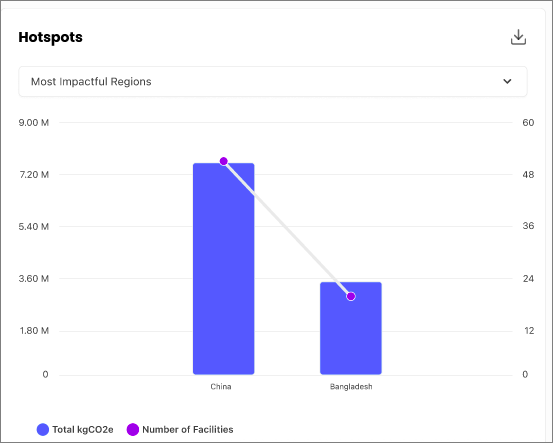
Initiatives
Armed with information from the previous visualizations, the company can click on any of the initiatives on the right-hand column to understand what to do next.
Clicking on the Coal Phaseout initiative reveals a table ranking facilities based on their normalized emissions, with a separate column indicating whether the facility has a phase out plan.
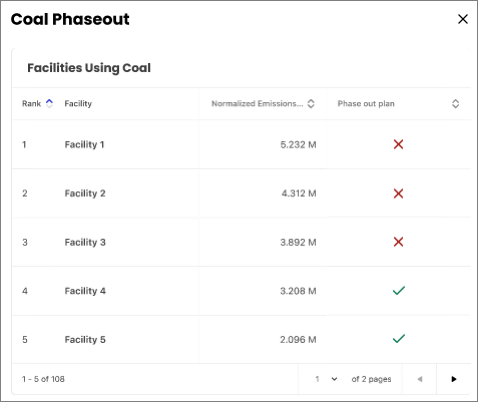
The company can also access a downloadable table containing additional columns and follow-up questions beyond the displayed table, as well as case studies and capacity building links at the bottom.
8. How to add tags after creating a cadence
Tags are used to help categorize, organize, or describe assessments.
You can manage tags by navigating to Assessments, selecting Higg FEM, and then selecting the Modules tab.
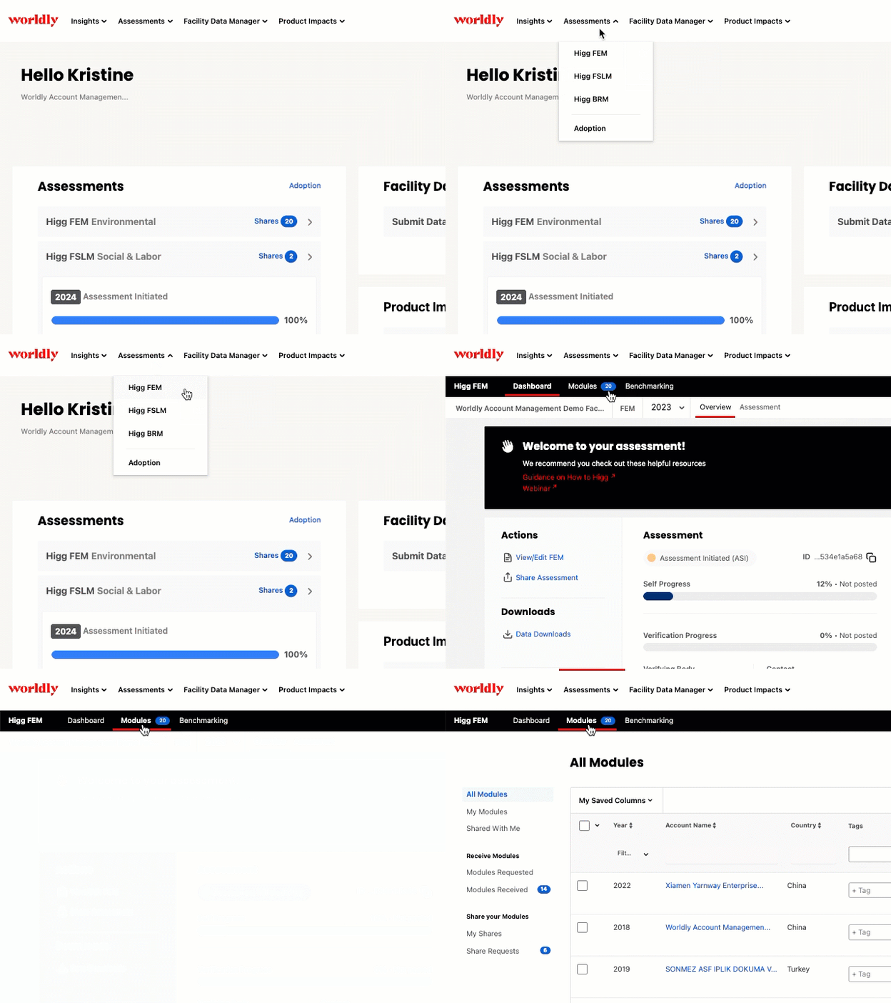
Adding a Tag
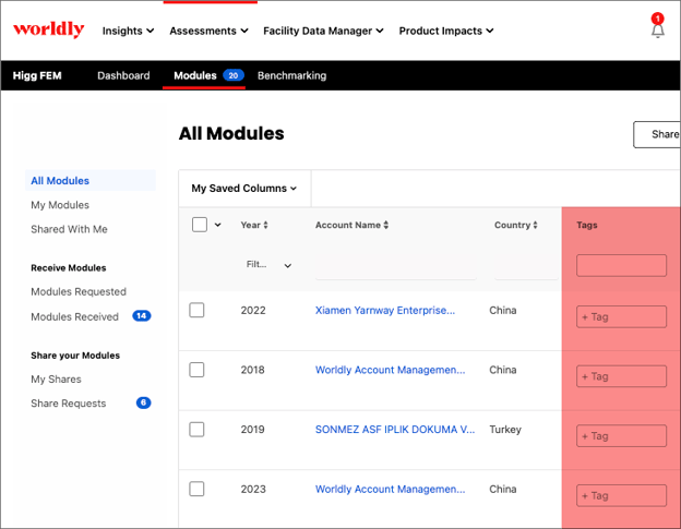
- On the Modules tab, notice the Tags column.
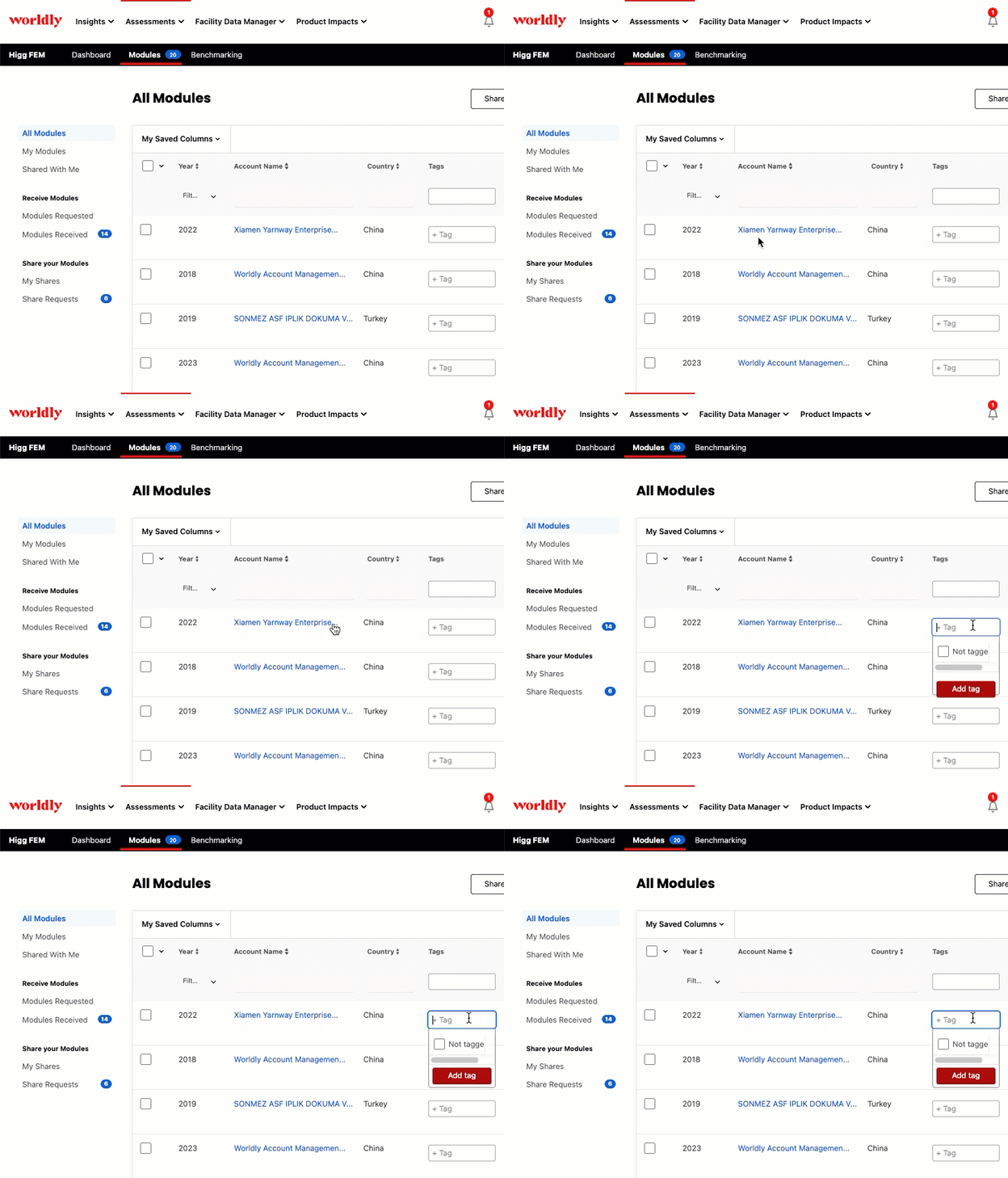
- Identify the assessment you want to add a tag to and click on the drop-down menu to the right.
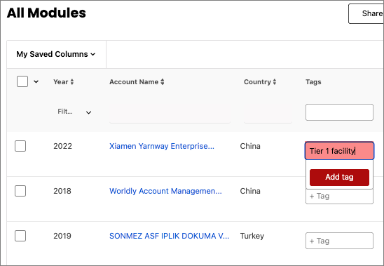
- Type in the tag you wish to add. In this example, we’re adding a tag to identify this assessment’s facility is a Tier 1 facility.
- Select Add tag. Once the tag is added, you can use the filter function at the top of the column to filter for assessments with that specific tag.
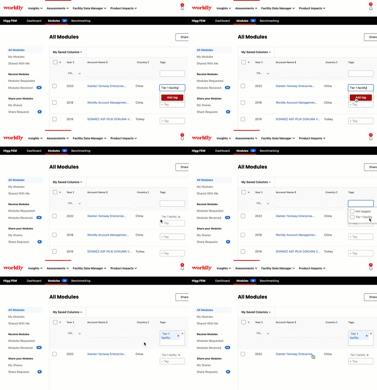
- The added tag will appear within Insights Hub, CSV exports, FEM Analytics, and wherever you can find tags.